OLD – SuperFrio News
Mercoagro 2018 will have business sessions and opportunity panels
Are business sessions and opportunity panels the events that SEBRAE/SC will promote in partnership with the Commercial and Industrial Association of Chapecó (ACIC) during the International Meat Business, Processing and Internationalization Fair? Mercoagro 2018. The fair will take place from September 11 to 14 at Parque Tancredo Neves, in Chapecó. The program includes four business sessions (one per day) to be held from 2:30 pm to 3:30 pm, in the Atílio Fontana Room (Yellow Pavilion). 49 companies will be able to participate in each session. Registration is free and open to the general public. The initiative consists of a meeting organized using a methodology that allows you to get to know and introduce yourself to companies that may be customers, suppliers...
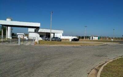
Marília/Vera Cruz is SuperFrio's newest unit
Inaugurated in October of this year in the City of Vera Cruz, the unit was strategically chosen as an important supply hub in the interior of São Paulo. This installation has the most sophisticated technology in environments with controlled temperature, the first phase being implemented with a capacity of 5,000 pallet positions in reversible refrigerated chambers for frozen and cooled products. In this project, SuperFrio had the important support of the local government and its anchor customer Aurora Alimentos. In the expansion phase SuperFrio is structured to be the leader in the Frio Market. This inauguration of Vera Cruz is part of the growth plan that SuperFrio has been implementing in Brazil. SuperFrio is a...
New SuperFrio Logo
To mark the moment of growth of the company, SuperFrio launches its new logo for the market. More beautiful and modern, the brand created by the agency Zero11, brings color, icon and typography different from the previous version. The blue used is a cold color that refers to the refrigeration business and also symbolizes power, leadership, in addition to conveying security and trust, which are so important in this moment of communication transition. The typology with a simple font, without many details and small curves follows the minimalist trend that simplifies reading and does not cause noise. Slightly italicized, it gives movement to the brand, everything to do with transportation. The circular symbol, a memorable element that brings symbolic values in its action and form, is...
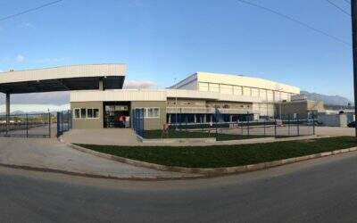
Itapoá/Garuva will be the new SuperFrio unit
With works expected to end in March 2019, the unit was strategically chosen as an important hub for the import and export of refrigerated products through the Port of Itapoá-SC. This facility has the most sophisticated technology for temperature-controlled environments, as well as a container yard for complementary services for the foreign market. The first phase will be implemented with a capacity of 14,000 pallet positions in reversible refrigerated chambers for frozen and cooled products and a patio for 500 containers with towers for 300 power outlets. In this project, SuperFrio has the important support of the local city hall and the Port of...
