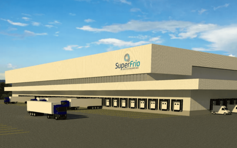
To mark the moment of growth of the company, SuperFrio launches its new logo for the market. More beautiful and modern, the brand created by the agency Zero11, brings color, icon and typography different from the previous version.
The blue used is a cold color that refers to the refrigeration business and also symbolizes power, leadership, in addition to conveying security and trust, which are so important in this moment of communication transition.
The typology with a simple font, without many details and small curves follows the minimalist trend that simplifies reading and does not cause noise. Slightly italicized, it gives movement to the brand, everything to do with transportation.
The circular symbol, a memorable element that brings symbolic values in its action and shape, is inspired by the refrigerator propellers of a cold room, which directly refers to refrigeration. In addition, the circle also brings concepts such as stability and continuity.
The change in the logo is yet another action that gives continuity to this expansion plan by SuperFrio, which hopes to further expand its excellence in a competitive manner and strengthen the company's business with the cold chain in Brazil.


